The three-dimensional portrait: likeness, pose and composition
A figurine can have the right hairstyle, a familiar jacket and plenty of detail yet fail to recall the person convincingly. Another, simpler figure may capture something immediately recognisable: a slight inclination of the head, the relationship between cheeks and chin, or a familiar way of standing beside someone. Likeness is not an inventory of accessories. It emerges from relationships between forms, which the wider composition can support or obscure.
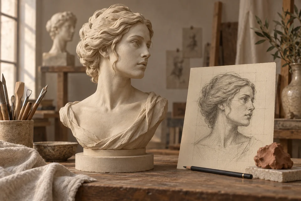
AI-generated editorial illustration comparing sculptural volume and drawing. The subject is fictional; this is not a photograph of a historical sculpture or a delivered product.
In this guide
Three-dimensional portraiture adds a problem that a photograph can avoid: what happens when the viewer moves? The profile, back of the head, shoulders and spaces between the arms still need to exist even when the chosen picture does not show them. A physical figure will also be seen at different heights and under different light from the most flattering preview.
This guide uses documented artworks to develop a practical vocabulary for commissioning a portrait. It is not a modelling tutorial and does not promise a percentage of likeness. Its purpose is to make requests more specific: which expression matters, how much of the body to include, what should lead the composition and how to review different views. When considering personalised 3D figurines, those decisions are often more useful than a general request for maximum realism.
Three different meanings of likeness
One meaning concerns structure: facial proportions, head width, profile and the relationship between nose and chin. Another concerns expression: the arrangement of eyes, cheeks and mouth at a particular moment. A third concerns personal recognition: a gesture, stance or outfit can immediately bring someone to mind. These levels support each other, but they are not identical.
A characteristic hat may identify the subject even when the face is weak. It is a narrative aid, rather than evidence that the face works. Conversely, a well-proportioned head can feel unfamiliar if it carries an expression the person rarely uses. When reviewing a proposal, ask separately whether the structure, expression and character of the scene are recognisable.
There may be no single photograph that represents someone definitively. Faces change with movement and time; relatives may associate the same person with different images. The opening question should therefore be concrete: are we preserving one occasion or seeking a more general representation? The answer changes how departures from one particular photograph should be judged.
For a wedding keepsake, the pose in a chosen picture may be central. For a portrait of a parent, a formal photograph may be useful for facial information while a quieter everyday expression better suits the intended memory. Neither approach is inherently superior. What matters is an explicit relationship between reference and intention.
A face is a volume, not a frontal outline
A frontal photograph encourages comparisons across a flat plane: eye spacing, mouth position and outer contour. A sculpted head also needs depth. The nose projects from the cheeks, the forehead turns towards the temples, and the jaw continues towards the ears. A convincing front view does not, by itself, establish a convincing profile.
Reviewing at three distances helps. From farther away, assess the overall mass. At an intermediate distance, examine relationships between parts. Close up, inspect selected details. Beginning with enlarged eyelashes or jacket texture can lead to polishing minor features while the connection between head and neck remains wrong.
Try describing a problem before naming one isolated feature. “The face looks longer than the reference” differs from “the nose is wrong”. The second observation may be accurate, but the impression could involve forehead, mouth and chin together. Describing a relationship helps prevent small, disconnected corrections that merely move the problem elsewhere.
A three-quarter view is useful because it shows aspects of both width and depth. It is not an automatic guarantee of quality; it complements the front and profile views. The aim is a coherent figure, rather than one especially favourable camera angle. Its important features should retain their relationships as the viewing position changes.
The distinction between observed and reconstructed parts is developed in our guide to turning a photo into a printable 3D model. It is particularly useful when a request about likeness depends on a view that the selected photograph does not show.
Houdon: accurate information does not finish the portrait
In 1785, Jean-Antoine Houdon stayed at Mount Vernon to portray George Washington. The estate's account describes observation from life alongside the making of a facial cast. Physical information and an encounter with the person formed parts of the same work. Mount Vernon on Houdon's life mask.
The example separates two questions that are often confused: how much do we know about a form, and what image do we want to construct with that knowledge? More precise information can reduce uncertainty. It does not choose the head angle, clothing, extent of the bust or relationship with the viewer. Those remain representational decisions.
For a contemporary commission, this distinction helps assign each reference a purpose. A photograph useful for facial structure need not determine the final pose. An image of clothing can clarify a collar without supplying the expression. Separating those roles makes the project easier to understand and prevents contradictory details from being combined without a decision.
The lesson is not to repeat historical casting methods. It is to recognise that documentation and interpretation work together. Establish what the references show, then decide how to organise it into a portrait. No quantity of images can substitute for an unspoken preference about the character the figure should convey.
Bernini: presence can depend on a selected moment
The Getty discusses Bernini's portraits in terms of their impression of living presence. His Portrait of Costanza Bonarelli, dated 1636–1638, is associated with immediacy; his bust of Clement X was originally placed high in a niche. Expression and viewing circumstances belong to the portrait's interpretation. Getty, Bernini and Baroque portraiture.
For a commissioner today, these examples raise two separate questions. Should the figure seem settled into a stable pose or caught during a passing gesture? And where will it actually be seen? A slight turn of the head can connect it to surrounding space, while a frontal position may create greater stillness. Neither is automatically more faithful to the person.
Expression should be selected rather than intensified by default. A broader smile does not necessarily produce more life. An open mouth can dominate a small face, whereas a restrained smile may leave other features more visible. If a particular laugh is the memory being preserved, openness may be essential. If the intention is an everyday portrait, it may be excessive.
Display height also deserves an early decision. A figure viewed from above on a desk presents its face differently from one placed at eye level on a shelf. A useful preview should include an angle close to the intended encounter, rather than being judged only from a perfectly centred virtual camera.
Rodin's Balzac: a portrait can choose an interpretation
The Musée Rodin records the Balzac monument's commission in 1891 and presentation in 1898. The writer had died in 1850, so Rodin worked with images, studies and living lookalikes. The final dressing-gown figure was rejected by its commissioners. Musée Rodin, Monument to Balzac.
A representation can therefore be coherent and still fail to match the expectations of those who requested it. Adding detail does not resolve every disagreement. The issue may concern the intended presence: formal or informal, descriptive or concentrated, focused on appearance or on an idea of the person.
For a figurine made from a photo, agree on that direction before the final review. “A calm representation in a familiar stance” points towards a different result from “an energetic moment of celebration”. Both can use photographs of the same person. Without a shared direction, successive corrections may each pursue a different portrait.
This does not require an elaborate artistic manifesto. The intention can be simple: the closeness of a couple, a musician's concentration or a friend's humour. A composition becomes clearer when its elements serve that intention instead of collecting characteristics that compete for attention.
Bust or full figure: deciding what to leave out
A bust concentrates the available space on the head, neck and part of the torso. A full figure can include stance, hands, clothing and contact with the ground. Neither is inherently more complete. Completeness depends on what the portrait needs to communicate. When the face is the main subject, a bust may be the most appropriate solution.
The boundary of a bust is not merely a technical crop. Ending near the neck, including the shoulders or extending down the chest changes the balance of masses. Very broad shoulders can make the face seem relatively small. A tight boundary can remove a meaningful gesture. Ask which parts of the body contribute to recognition before choosing the format.
The Getty's teaching material around Carpeaux's Portrait of Nadine Dumas considers head position, expression, dress, the bust's boundary and its pedestal. These are connected compositional decisions. Getty, Friendship Portraits.
If a person's characteristic hand gesture matters, a restricted bust might omit too much. If recognition centres on the face, adding shoes, ground and equipment may dilute the focus. The useful question is whether removing a part would lose something important. Simplification can make a portrait more precise in its purpose.
Head, neck and shoulders: pose begins before the arms
A small head inclination changes its relationship with the shoulders. Turning the neck can open the figure towards the viewer or another person. If head and torso appear to belong to different movements, the result may feel rigid even when each part is plausible in isolation.
Describe relationships when giving instructions: head directed towards the partner, chin slightly lower than in the photograph, shoulders relaxed. Words such as proud, gentle or confident can communicate an intention, but they need a visible choice behind them. Nor does every head angle have one universal emotional meaning. Interpretation depends on the subject and setting.
Distinguish intended asymmetry from error. One raised shoulder or an off-centre head can be part of the selected pose. Correcting everything towards symmetry may remove a familiar quality. The criterion is not universal regularity, but whether differences are consistent with the reference and intention.
A practical check is to mentally remove the accessories and examine the larger masses. Does the character still take the intended stance? If recognition depends entirely on an object held in the hand, the bodily pose may need clarification before further detail is added.
Expression: a familiar trait or a fleeting instant?
A raised eyebrow might be habitual or accidental. Narrowed eyes might belong to a smile, bright light or movement. A photograph can have emotional importance without every feature in that instant needing to become permanent in the figure. Any change should nevertheless be explicit, rather than an automatic correction towards an ideal of beauty.
Messerschmidt's character heads make expression particularly conspicuous. For The Vexed Man, the Getty describes tension involving the eyes, lips and neck, together with the treatment of alabaster. The effect involves several areas rather than one feature alone. Getty, The Character Heads.
The practical implication is to review an expression as a whole. Changing only the curve of the lips can leave the rest of the face inconsistent. Gaze direction and chin position also affect the impression. The purpose is not to infer character from facial anatomy, but to check whether the selected expression matches the request.
A helpful annotation distinguishes what to retain from what to alter: preserve the uneven smile, reduce the mouth opening, do not make the face younger. These requests are more assessable than “make it nicer” or “add personality”, which can invite changes that were never intended.
The body communicates through support and direction
A pose is not a collection of coordinates. The body should appear to occupy space intelligibly. Where is it supported? Which leg carries its weight? Do shoulders follow the pelvis or turn against it? Specialist anatomical language is not required to notice when a figure seems stranded between two actions.
The most recognisable movement is not always its most extreme point. A musician may be conveyed through attention towards an instrument. For an athlete, the moment immediately before or after an action may read more clearly than a very open position. The choice depends on memory and scale, rather than a universal preference for maximum activity.
The National Gallery of Art documents wax and real clothing materials in Degas's Little Dancer Aged Fourteen, exhibited in 1881. Its account distinguishes bodily form, surface and added elements. National Gallery of Art on Little Dancer.
A modern project can use that distinction without imitating the technique. First assess whether the body communicates the stance, then whether clothing clarifies it, and finally whether accessories help. This is an order of observation, not a universal production procedure. It helps locate the part of a proposal that actually needs revision.
Hands and accessories: give each a role
Hands can communicate relationships: holding, supporting, pointing or resting. They can also create ambiguity. An object that seems barely touched instead of held changes the action. A hand hidden behind another body can make an embrace difficult to understand. Before discussing individual fingers, establish what the hand is meant to do.
An accessory needs an explicit priority. If an instrument is essential to the scene's identity, its recognisable form matters. A secondary object can be simpler. Adding a bag, hat, plaque, ball and decorated base can make the person less evident. Every addition occupies visual space, however small it is.
Try summarising the scene in one sentence. If it concerns two people supporting each other, their contact matters more than decoration. If it concerns a profession, one tool may be central. The number of details does not measure the amount of meaning. Their relationship with the intended memory is what makes them useful.
Silhouette and empty space: what reads at a distance
The silhouette is the figure's overall contour. Spaces between arms and torso, between legs or between two people also affect readability. They are shapes even though they contain no material. A pose can be clear from the front and confusing from the side when parts overlap.
Look at the preview at a reduced size. If everything becomes an indistinct mass, establish whether the problem comes from the camera angle or the composition. Separating parts farther is not always the answer. A small rotation or a different relationship between arm and body may be enough.
Silhouette review does not replace facial review. It has a different purpose: checking that action and arrangement are intelligible before close inspection. For a figure intended for a shelf, this can matter as much as a detail visible only when the image is enlarged on a phone.
The spaces should also remain consistent with the gesture. Opening a gap for clarity can change an embrace; closing one can make a hand appear fused to clothing. Any alteration needs to be considered as part of the action, rather than treated as a purely decorative adjustment.
A couple is a relationship, not two separate portraits
Two figures share a base, but more importantly they share space. Distance, face direction and points of contact describe their relationship. Even convincing heads can produce an awkward scene if the bodies appear to ignore each other or one person hides the other from the main view.
Choose which relationship takes priority. Looking at each other, standing side by side, embracing and facing the viewer together are different compositions. A photograph may make contact clear through colour or background; the same overlap can be harder to read in one colour. The artistic decision is to preserve the gesture's meaning, not necessarily every overlap in the picture.
Relative heights also need attention. A genuine difference can be important to recognition. A perspective effect in the photograph can be misleading. State which proportions belong to the people and which depend on their positions, rather than assuming that the picture supplies exact measurements.
Review the group before reviewing each person. Does the scene convey the intended closeness? Is there room for both faces? Do the hands clearly belong to their respective bodies? Then examine profiles and the back. A couple should not be assessed only as two independently successful portraits placed next to one another.
Clothing and hair: recognition without counting every detail
Clothing can recall an occasion, profession or habit. Its broad volume often matters before buttons and seams. A structured jacket changes the relationship between head and shoulders; a skirt changes the silhouette; hair defines part of the face's outline. These are elements of form, rather than optional decoration applied at the end.
The Met describes its Louise Brongniart by Houdon as a later variant of the childhood portraits shown in 1777, with a different treatment of the head covering. Subject identity and variants of presentation can therefore be distinguished. The Met, Louise Brongniart.
For a personal project, ask which elements belong to the memory being preserved. A current hairstyle may be important, whereas one stray lock in a particular photograph may not be. If that lock is a familiar characteristic, simplifying it could remove recognition. Priorities should come from knowledge of the person, not a general ideal of tidiness.
It is also worth distinguishing an important garment from its least visible details. Preserving the cut of a wedding outfit may matter more than reproducing every small fastening. The choice becomes easier when the commissioner identifies the garment's role in the portrait rather than requesting undifferentiated accuracy everywhere.
Scale creates a hierarchy of detail
A head occupying a small part of a full figure does not offer the same visual space as a bust. Requesting more details does not automatically make them readable. The choice is hierarchical: which elements must be apparent at normal viewing distance, and which can emerge only through close inspection?
Before approval, view the proposal at its intended size. An enlarged preview can make an incision seem important when it will be very discreet in the physical object. An incorrect mass can remain apparent without magnification. Review should prioritise what survives the reduction.
Compromise should not become a vague excuse. If a central feature risks becoming unreadable, discuss size, composition or simplification. The guide to 3D-printed PLA figurines covers production considerations. Here the task is to establish what the portrait cannot afford to lose.
A useful decision is to identify a small number of non-negotiable visual priorities. They might be a facial relationship, the contact between two hands and the outline of an instrument. That does not make every other part irrelevant. It ensures that the project has a clear basis for choosing when demands compete.
One colour and changing light
In a photograph, colour distinguishes lips, irises, fabrics and hair. In a single-colour figure, many distinctions depend instead on shape and light. A coloured feature does not automatically become a relief. Decide which information is geometric and which belongs to the photograph's surface appearance.
Dramatic lighting can make a proposal striking while concealing weak transitions. Very flat lighting can suppress correct volumes. To compare revisions, keep conditions similar and include at least one clear, neutral view. A lighting change should not be mistaken for a change in shape.
Consider finish in relation to intention too. A visually active surface may compete with small features, while a quieter one may leave more attention for facial planes. No finish is universally best for every person. Material appearance, scale and composition should support the selected portrait together.
The same applies to background. A dark background may separate one outline beautifully while obscuring another. Reviewing against more than one simple background can clarify whether the figure itself works. The goal is not to find an unflattering presentation, but to avoid approving the background's contribution as though it belonged to the object.
Writing a brief that can actually be assessed
A useful brief moves from purpose towards visible decisions. “A gift recalling her interest in the piano” explains why the project exists. “Seated, concentrating on the instrument, without a theatrical expression” clarifies tone. “The face and hand position matter more than bench decoration” sets priorities.
Then separate what must be retained from what can change. The list might include an uneven smile, familiar glasses, a height difference or contact between hands. Base shape, minor folds or barely visible details may be more flexible. This prevents every element from being treated as equally essential.
Specifying what should not be idealised can matter as much as requesting an addition. Do not make the face younger. Do not slim the body. Do not turn a quiet stance into a heroic pose. These are representational preferences, rather than defects awaiting correction. The person should not have to fit a generic model of perfection.
The page about a custom figurine from a photo presents the contemporary service. This brief helps make an idea understandable; it does not imply that every alteration is available or that a request can overcome all limits of the references and production process.
Review in an order that prevents contradictory corrections
The first review should address the whole project: subject, pose, number of people, format and orientation. If these are wrong, perfecting a belt buckle is premature. Next consider proportions and recognition. Only then move towards expression, clothing and secondary detail.
Comments work best when they connect a visible part to a reference. “In the front view, the chin looks narrower than in the selected photograph” can be assessed. “It does not look like him” communicates a real problem but does not locate it. It can start the conversation; a useful correction requires a more specific difference.
Avoid incompatible requests. Preserving an exact pose while turning the head considerably may change the whole balance. Asking for a slimmer figure with unchanged proportions creates another conflict. The discussion should establish which objective matters most, rather than accumulating instructions that cancel one another out.
Compare versions using equivalent views and remember what was requested. A more attractive overall impression does not demonstrate that the previous issue has been resolved. A short priority list keeps review focused and prevents every new image from reopening all earlier decisions.
It also helps to distinguish a new preference from a correction. Choosing a different outfit is legitimate, but it is not the same as correcting the outfit previously agreed. Clear language makes the conversation easier and avoids treating every change as evidence that the earlier proposal was misunderstood.
Three illustrative decisions, without one compulsory answer
Imagine a reserved person known for a restrained smile. The sharpest photograph shows them laughing with an open mouth. One choice is to preserve that laugh because it recalls a particular occasion. Another is to use further references for a more habitual expression. The better choice depends on purpose, not on whether the smile is large or small. The brief should say which memory is to become permanent.
In a second hypothetical case, a couple wants a wedding figure. Their favourite photograph cuts off one hand and visually compresses the gap between their bodies. Literal imitation could create an unclear tangle. A proposal might preserve dress and closeness while clarifying the contact. That alteration should be assessed against the couple's gesture, rather than described as certain reconstruction of something the photograph does not show.
For a third case, imagine a keen walker. A backpack, poles, rock, hat and plaque are all possible. If every element becomes equally prominent, the face disappears within an inventory of equipment. A concentrated composition might retain one decisive accessory and a familiar stance. Another might deliberately choose a fuller scene. The criterion is hierarchy, not a universal preference for minimalism.
These are teaching examples, not customer testimonials or results of tests. Each demonstrates a different decision arising from a different intention. Identify what should be recognised first, what supports it and what can be simplified without changing the memory. That is more useful than declaring one style correct for everyone.
The base and viewing angle belong to the portrait
The base does more than mark where a figure ends. It establishes a relationship with the supporting surface and can change the whole work's tone. A tall base separates the subject more strongly from everyday space; a low one can make it feel closer to the surface on which it stands. These are effects to examine in the individual design, not fixed meanings of every pedestal.
For a single figure, consider whether the base feels excessively wide for the pose or cramped beneath projecting elements. For a couple, its shape can unite the bodies visually or leave them seeming merely adjacent. If an inscription is planned, it should have a readable place without unnecessarily reducing the subject.
A name, date and dedication perform different jobs. The name identifies, the date connects to an occasion and the dedication introduces the giver's voice. All may be appropriate, but none is compulsory. Before choosing a long sentence, consider whether it should be readable from the normal display distance or only during close inspection.
Inscription direction matters too. A base with an obvious front suggests where viewing should begin. If the principal pose reads best from another angle, that relationship needs resolving. It is an easily overlooked compositional issue when review consists entirely of close-up facial images.
When several people judge the same face
People who know a subject well may still disagree about a portrait. One associates them with youth, another with recent years; one recognises the smile most strongly, another the profile. This does not make all judgements arbitrary. It suggests that the reviewers may be using different unstated references.
Before collecting corrections, agree on the period represented and the principal reference. Then separate shared observations from personal preferences. If everyone notices a narrow jaw, that differs from a disagreement between smiling and composed expressions. One concerns an observed difference; the other concerns the chosen tone.
One ordered set of priorities is more useful than conflicting messages delivered at different times. It can address proportions first, expression next and secondary elements last. Agreement on every tiny detail is unnecessary for a clear request. What matters is knowing who decides and which intention guides the result.
For a surprise gift, consider the recipient's preferences without assuming they want to be younger, slimmer or more heroic. An affectionate representation can preserve age, posture and distinctive features. Respect includes not automatically treating familiarity as imperfection.
A final check at three distances
At room distance, ask whether the figure has a clear focus: a person, a couple or a gesture. At normal observation distance, examine faces, orientation and relationships between bodies and accessories. Close up, review the features identified as important. This order prevents one successful detail from concealing a problem in the whole.
For every observation, also distinguish shape, lighting and presentation. A shadow beneath an eyebrow can resemble a changed expression; a camera turn can alter apparent facial width. Compare equivalent views before requesting a modification. This does not remove personal judgement. It gives that judgement a clearer basis.
If the figure works only from one precise angle, establish whether that angle matches its intended display. An object designed primarily for frontal viewing can have an explicit hierarchy. One intended to be turned around and examined closely needs coherence from several directions. Approval should concern the expected experience, not just the most favourable image.
A final written note can make that approval clearer: identify the version reviewed and the main views used, then record any remaining agreed limitation. This is particularly useful when several proposals have similar filenames or appearances. The note should describe the actual decision, rather than imply that the portrait has passed a scientific likeness test. It preserves a shared understanding of what was selected.
Frequently asked questions
Does more detail mean greater likeness?
Not necessarily. Correct details can enrich a coherent face, but they do not automatically compensate for incorrect proportions or an unfamiliar expression. Assess overall head form, relationships and posture first. Then ask which smaller features genuinely improve recognition at the intended size.
Is a smile better than a neutral expression?
It depends on the person and memory. A familiar smile may be strongly identifying; an accidental one may preserve an unwanted instant. Neutrality is not automatically more accurate. Choose with clear references before judging individual revisions.
Is a full figure more personal than a bust?
Not by definition. A full figure includes gestures and clothing but spreads attention across more elements. A bust concentrates attention on the face and upper body. The more personal solution preserves what matters about the subject without adding parts merely to suggest completeness.
How can I tell whether the issue is the face or pose?
Assess the head and whole separately. If the isolated face feels familiar but the scene does not, orientation, body or expression may be decisive. If the pose works but the person looks generic, return to proportions and identifying features. These are observation tools, not an automatic diagnosis.
What should be clear before approval?
The portrait's intention, reviewed views, pose, priority characteristics and agreed simplifications. It also helps to distinguish referenced information from interpretive choices. A convincing figure does not eliminate decisions. It makes them consistent with the person and the reason for representing them.